your stuff is realy nice. some of your characters are a little stiff and you could try and push the design a little more. as for your layout try to lead the eye with the line quality. but they are very nice.
Hey thomas! Thanks for the awesome crits....i find that my stuff looks such better rough and i loose a lot of my gesture when i clean it up..how do you normally work cleanup? and yeah ill definitely try and push the design elements more...thanks man
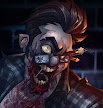
Clean-up is tough, I'm not really sure I'm all that good at it. Fabi and Peter told us that it's a little bit of top planes = light or thin lines and bottom planes = darker heavier line. Also stuff coming nearer has a thicker line. Alot like line quality period. But as that's my worst fault I'm still trying to get the hang of it.
Ur stuff is really cool! I honestly like it and hope to become as good as u one day. Im trying a lot..honestly I am! Maybe I can post some of my work to u? Hope u'll be able to give me some pointers. The latest Im working on is a new BHS logo! U know I love ur work! Tomi

4 comments:
your stuff is realy nice. some of your characters are a little stiff and you could try and push the design a little more. as for your layout try to lead the eye with the line quality. but they are very nice.
Hey thomas! Thanks for the awesome crits....i find that my stuff looks such better rough and i loose a lot of my gesture when i clean it up..how do you normally work cleanup? and yeah ill definitely try and push the design elements more...thanks man
Hey Bingu, nice blog.
Clean-up is tough, I'm not really sure I'm all that good at it. Fabi and Peter told us that it's a little bit of top planes = light or thin lines and bottom planes = darker heavier line. Also stuff coming nearer has a thicker line. Alot like line quality period. But as that's my worst fault I'm still trying to get the hang of it.
Hey Bingu,
Ur stuff is really cool! I honestly like it and hope to become as good as u one day. Im trying a lot..honestly I am! Maybe I can post some of my work to u? Hope u'll be able to give me some pointers. The latest Im working on is a new BHS logo!
U know I love ur work!
Tomi
Post a Comment